Hand Lettering: Getting Started Guide
Hand lettering is a popular technique for combining inventive typography with art and décor. Hand lettering is not the same as calligraphy. It is not actual handwriting at all. In fact, even if you dislike your own handwriting, you can still create beautiful hand lettered art.
Hand lettering is a kind of drawing, where the subject of the drawing is letter forms. Each letter is drawn individually. Getting started with hand lettering is relatively easy and inexpensive. Basic supplies are portable and few. And lettering Inspiration is all around us, from product packaging to magazines to digital media.
What You Need
Pencils
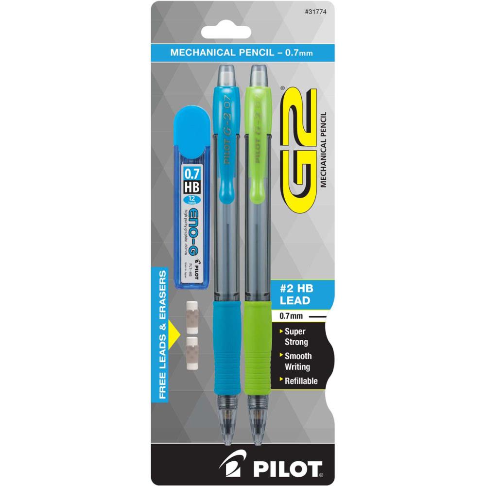
A student grade pencil set that includes a variety of pencils like this Generals kit makes a good option for hand lettering. Graphite pencils range in hardness from 6H (hard) to HB (middle-hardness) and 6B (soft). Use the harder pencils to sketch your design because they create lighter lines. The softer pencils lay down darker color and can be used to fill letters during later stages of drawing. Mechanical pencils are another option for sketching designs that never need sharpening.
Tip: When marking over pencil lines, avoid smudging by resting your hand on top of scrap paper instead of the drawing itself.

Pens
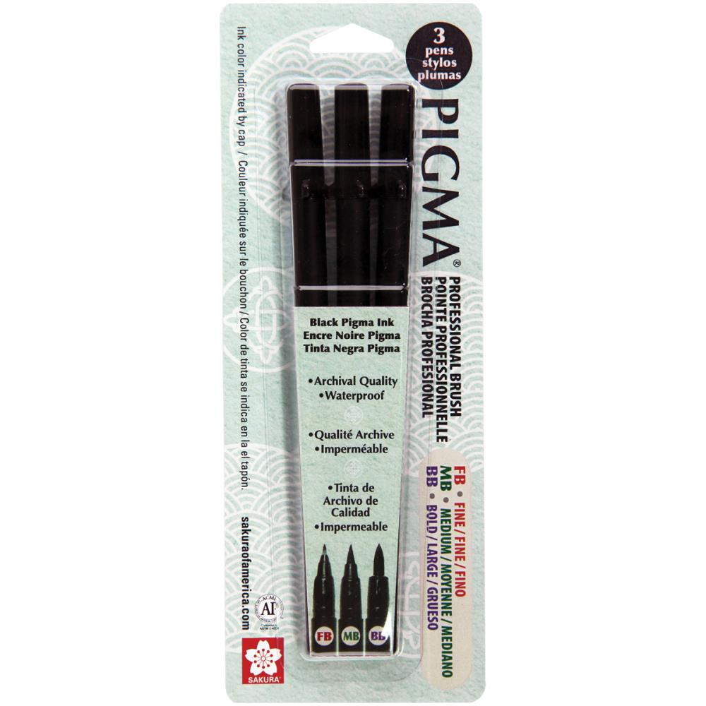
A good black fine point ink pen is a staple for hand lettering. Micron pens come in a variety of nib sizes like those in this 6-piece set, ranging from .2mm to .5mm. The smaller sizes are ideal for drawing details. Use the larger sizes to fill letters with even black ink. In addition to black, these pens are available in colors including brown, burgundy, green, orange, purple, red, rose, blue, sepia, and yellow.
Brush pens are another popular ink pen used for hand lettering. The tip of a brush pen is long and flexible, like a paint brush. Brush pens are used for brush lettering, a type of lettering marked by variable width lines. The downstrokes of brush letters are thick, and the upstrokes thin. Brush lettering combines best with very smooth paper. Hold these kinds of pens at a 45-degree angle during use.

Paper
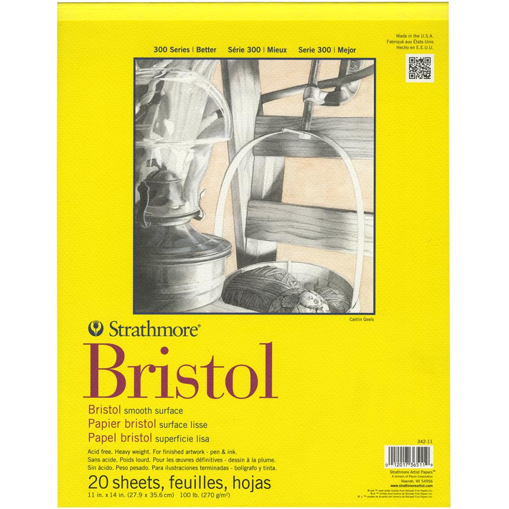
Plain white printer paper is a good option for lettering practice and creating initial sketches for a lettering design. Some artists also recommend preparing to letter by practicing on graph paper. The grid line on the paper help with vertical and horizontal letter alignment and slant. A better-quality, acid-free paper is suggested for finished artwork, however. A smooth paper like Bristol works well with a variety of pens and its thicker weight will not allow ink to bleed through the back of the paper.
You can print your own practice paper at http://calligraphypaper.appspot.com/. Though developed for calligraphers, hand lettering artists may also like these sheets for lettering practice. The app creates blank lined sheets based on your specifications for letter size and slant.

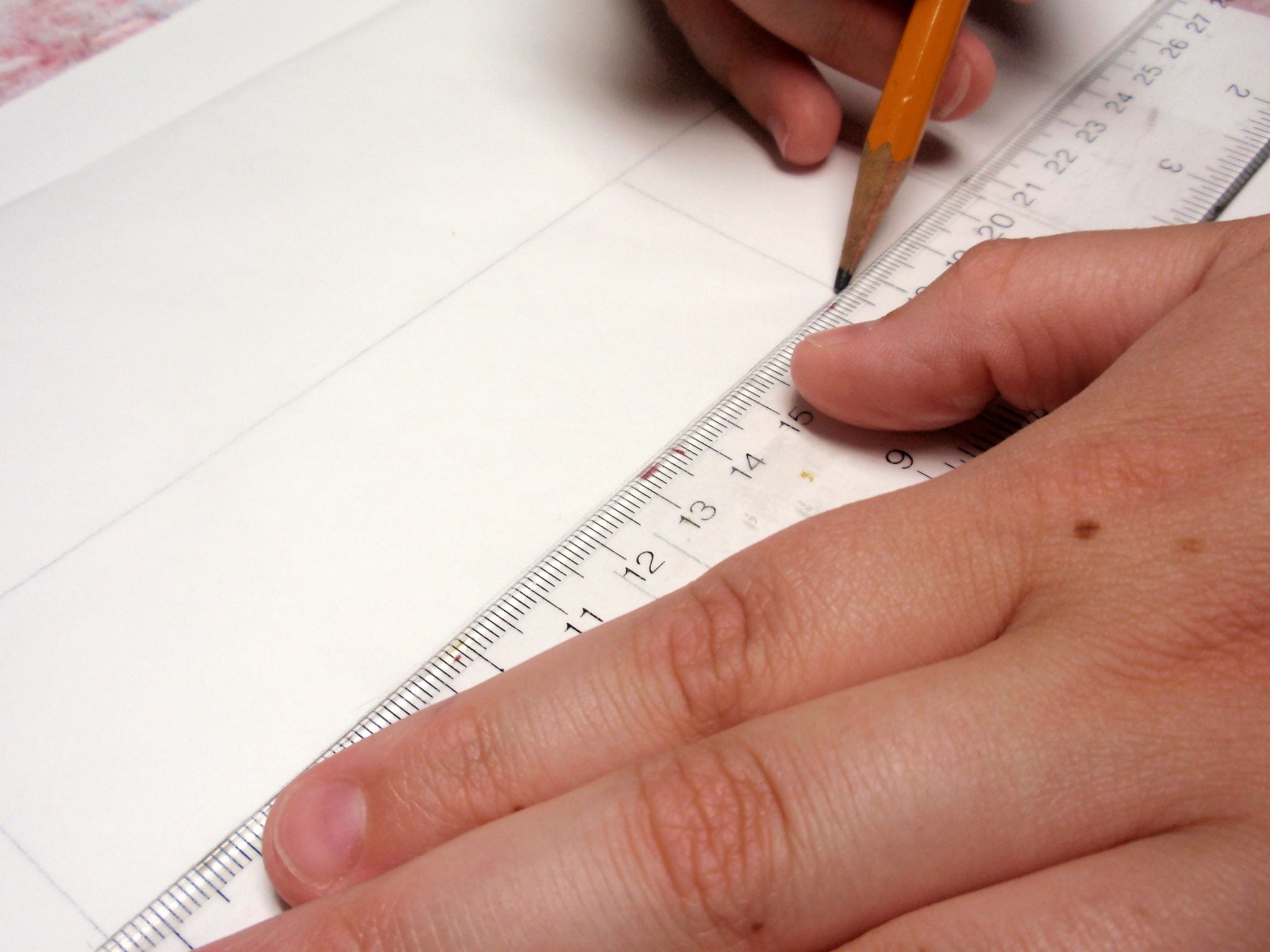
Ruler
You’ll likely find a ruler helpful for planning line and letter placements on a page. You can use it to block out your overall design as well as space lines and single letters properly.

Traditional lettering is positioned on the baseline as illustrated below. Creative lettering, of course, often deviates from traditional placement. However, beginners may find it useful to practice lettering “between the lines” to maintain balance and cohesion of letter forms before deliberately moving away from such placement.

A ruler is also valuable for establishing the vertical space between lines of text and the horizontal space between letters and words. Vertical spacing is known as leading and horizontal spacing as kerning or tracking. Both these can be manipulated by the designer for different visual effects.

Getting Started
Letters of all types are part of our daily lives. One of the first steps for getting started with hand lettering is simply noticing letters. How are the letters constructed? What letter styles do you find most attractive? How do the letters make you feel? As with many kinds of design, it is helpful to collect samples of lettering that appeal to you. Assemble these in a notebook or journal that you can use for inspiration when you work.

As you collect, note that letters forms can be divided into the following distinct groups.
 SERIF letters have bars or lines at the ends of their strokes. Serifs make a letter easier to read in print, which is why these letters are the traditional forms used in newspapers and magazines. Feelings associated with serif letters include timeless, expensive, traditional, conservative, traditional, and grand.

SANS-SERIF letters do not have bars at the ends of their strokes. Sans-serif letters are perceived to be modern, inventive, clean, neutral, reliable, and professional. These fonts are preferred for text that will be read from a screen (as on a website).
 SCRIPT letters use fluid strokes reminiscent of handwriting. Script lettering encompasses styles ranging from casual to formal (like actual calligraphy). It often suggests the subject matter is elegant, feminine, intimate, creative, whimsical, or romantic.
 DECORATIVE letters may also be called Ornamental or Display letters. These letter forms got their start on posters and advertising and are artistic and attention-grabbing. Decorative lettering is appropriate for conveying a subject is expressive, quirky, loud, or bold.
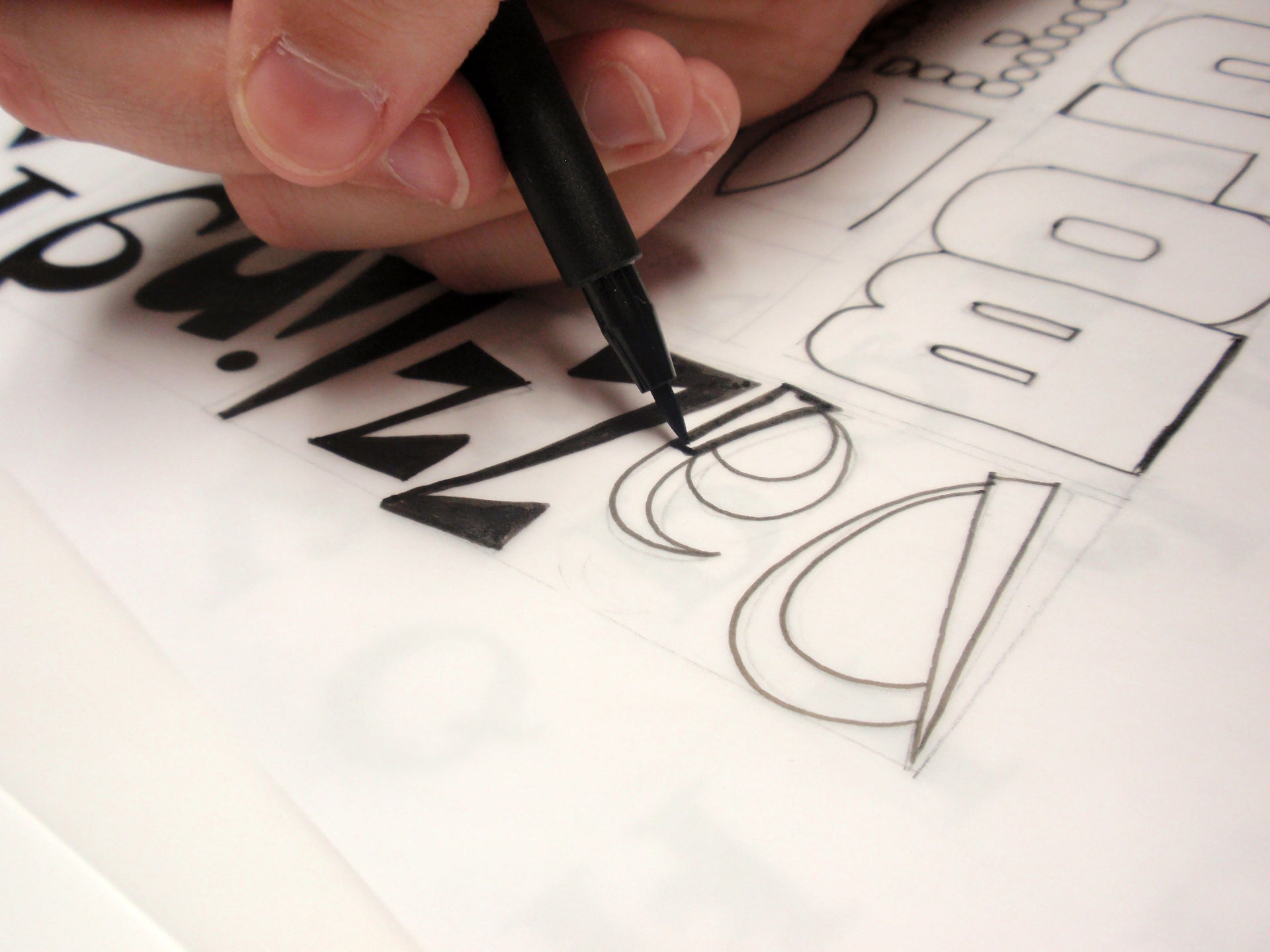
After you’ve collected lettering samples that inspire you, put your printed materials to work in learning to draw letters. You can begin by tracing the letters to warm up your muscles and get used to drawing the forms. Later, reproduce the letters without tracing. Practice every day if you can and fill entire pages with your work. Use inexpensive printer paper so you’re not worried about making something perfect, but just focused on the process.


When you’re ready, use a pencil to sketch a word or phrase for a finished piece of art. Focus more on the overall layout for the piece than on getting the letter forms just so.

Once you’ve established the general alignment for your phrase, create lines or shapes as guidelines for your individual letter forms. Work lightly in pencil so you can erase your guidelines later.
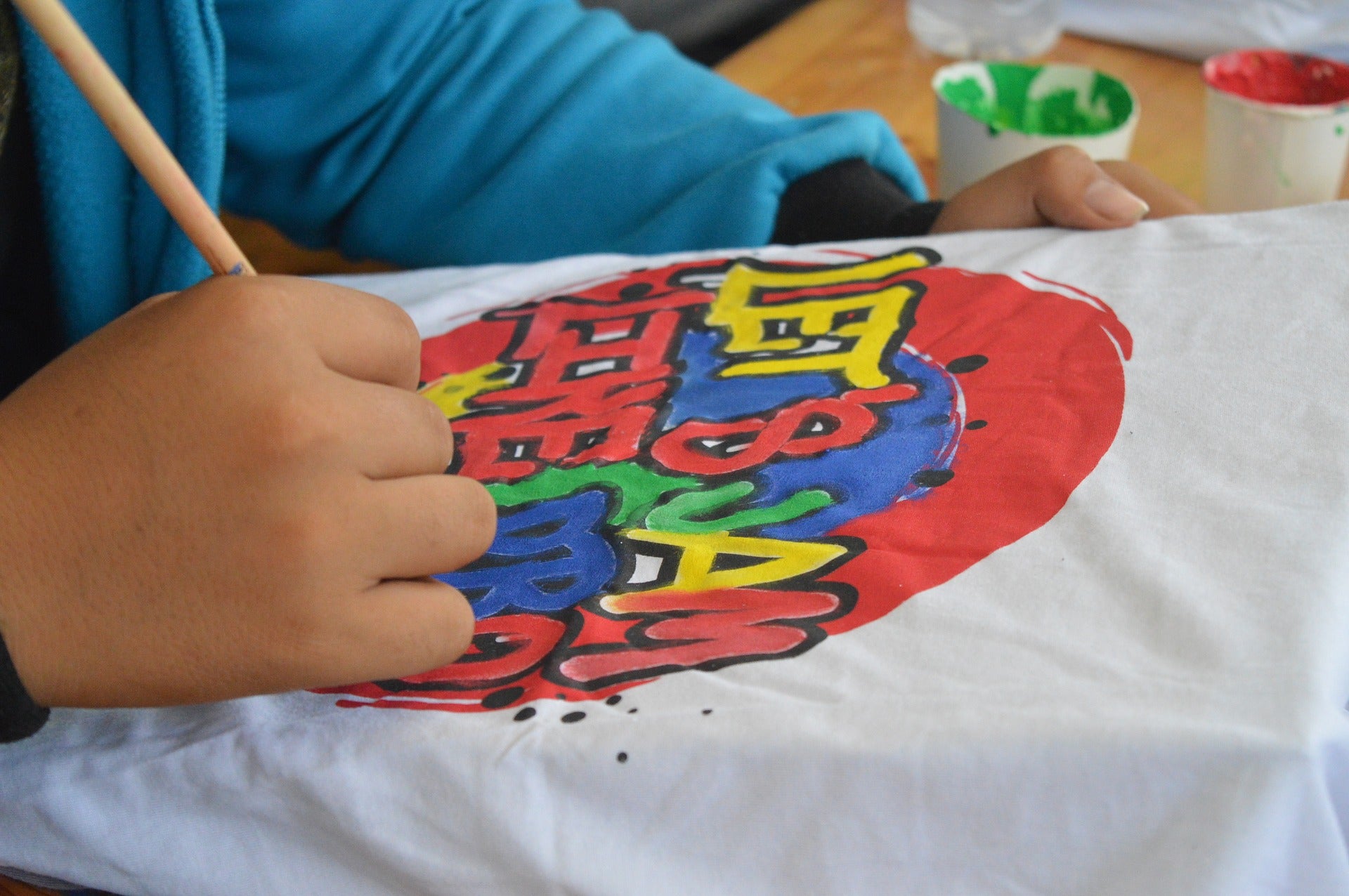
Sketch each letter lightly with a pencil. Finish developing the shape of each letter. When you’re happy with the lettering, trace around the letters using a fine tip marker. Fill in the letters using black or colored ink if desired.


Tip: If working on white paper, use a white gel pen to cover small mistakes.
Add flourishes or details to enhance the art. Details might include shadows, lines, dots, or swirls. Letters that rise above the cap line or extend below the baseline are good places for additional detailing.

Moonlight Twinkles Using Brusho Crystals and Hand Lettering
FEATURED SALES